
U-Haul App
The U-Haul mobile application was designed to integrate many of the web-based services onto a “take-it-anywhere” device. Where users could book their trips, order supplies, reserve equipment, and even check equipment in without ever speaking to a staff member.


Competitor Benchmarking
The initial approach I used towards making a new application was understanding what users had come to expect from our competitors. This gives us an overview on what users can expect on their end, as well as what we can do to improve on our end.
I looked at companies from the perspective of their corporate entities/business models, as well as their offerings from a usability perspective. In order to do this efficiently I went through each competitive user flow all the way up to check out. These included the e-commerce moving supply checkout flows, truck rentals, etc.
I could never collect all of the data on my own, so I give a bug thank you to my fellow UX designers at U-Haul for assisting me in preparing the report for all of this. It was MASSIVE.

Discovery User Research
In order to understand the user with more clarity, I needed to get closer to the activity. My team & I conducted in-field discovery research alongside customer service representatives to better understand the user affinities and pain points associated with our primary demographic.
I walked through the process of ordering supplies and reserving moving help. I then listened in on CSR recordings. These were the calls of users attempting to reserve equipment. It gave me a real glimpse into what user can anticipate experiencing real-time.
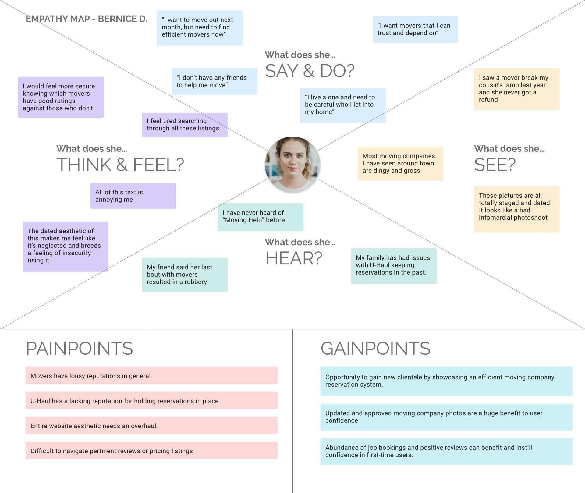
I next synthesized the user data into an affinity map, as well as an empathy map for user needs. These maps assisted me in expressing user needs, as well as business needs within the design process to leadership within the organization.
From here, we gathered further user data and formulated user personas from the auxiliary research.

User Personas
Then next step in procuring user research was creating a series of user personas to reflect the user base. The challenge here is the very broad and diverse audience that U-Haul serves, because everyone moves. The most common access points for users are the following:
In-town or local moves
Cross country or one-way moves
Storage customers
Moving supply purchases
Each persona is indicative to the challenges and goals associated with renting various U-Haul equipment and purchasing supplies. I also varied the personas by age and gender to further diversify their representation.


Card Sorting and Early Concept Work
I worked on understanding what the user would be looking for in terms of hierarchy. The member dashboard would consist of quick links out to the various departments, based on need. The tricky part was determining the importance based on user need.
This is essentially where the card sorting exercise came in. I was able to moderate 8-10 different sessions of people bucketing their services into different categories. The primary hierarchy of need came down to truck rentals, storage management, then trailer rentals, followed by moving supplies and moving labor. Some options were account-specific, while others remained account-agnostic.
This was a fun process that helped shape the way I would present the interface and its functionality to prospective users in the future.


User Paths & Information Architecture
Creating user paths early on was reliant on coordination with the primary stakeholders of the product. These included the department heads of trucks, trailers, packing supplies, and moving help.
The member dashboard would consist of quick links out to the various departments, based on need. The tricky part was determining the importance based on user need.
The process of checking in/out equipment was established early on to be the primary utility of the application, so we prioritized our experience efforts around that. This was followed by the integration of other product services like supplies, etc.
Establishing the flow of user interaction and information architecture was supplemented by card sorting exercises and wireframe maps like these.
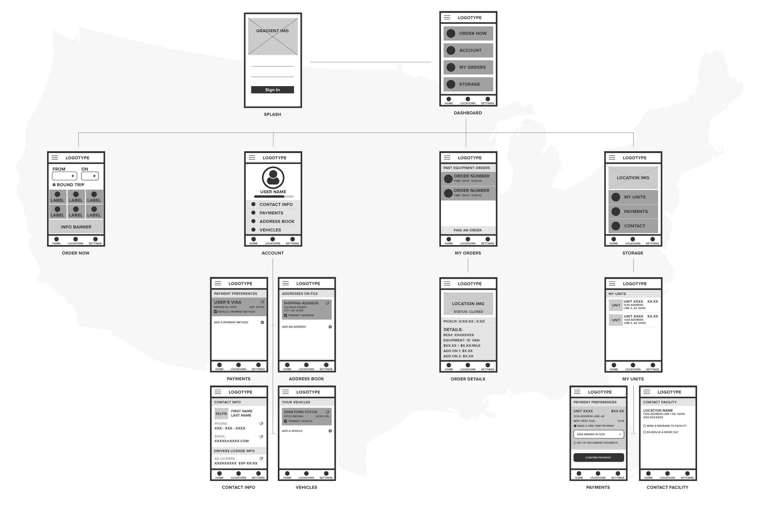

Wireframes & Mockups
Once the architecture was mapped out I began producing wireframes to illustrate the user flow of interaction. These prototyped wires were focus tested on a pool of individuals representative of our user base.
Unfortunately many of the working files from these stages have been lost to time and deceased hard drives (RIP), so these are the only images I have leftover from the concept building phase of the app’s design.
I can tell you though that we followed U-Haul branding guidelines closely and made the UI as clean and minimalistic as possible. The minimalist aesthetic speaks to the utility functionality of the app. Users download it with the expectation of utilizing it to reserve, manage, and pay for their move/storage needs. Once that need has been fulfilled, the app may be discarded until future need.
This is not to say that there is no benefit afforded to repeat users, as account detail inputs and location tracking can expedite the user’s upcoming move or storage need.


Launch and Lessons Learned
The app initially launched in 2017 via iOS and Google Play app stores. To say that the initial launch was rough would be an understatement. Core functionality and usability guidelines were stripped in favor of a lean launch.
The order tracking functionality was removed and the self check-in/out process proved to be nightmarish on the user due the amount of information collected necessary to complete an order. The design team fought tooth and nail to retain features that eased the UX, but sometimes one must pick their battles and reconstruct their roadmap for future improvements.
Agile would prove to be the way to go, as features like gps linking, roadside assistance, order tracking, account linking, native user feedback acceptance would be added to supplement the bare release. As of July 2023, the app retains a 4.5 out of 5 star rating from over 215K ratings and reviews.