
SilverSneakers LIVE
SilverSneakers LIVE is a live-streaming fitness offering for eligible members. The service utilizes Zoom APIs to present classes to thousands of older adults every day. In late 2020 my team was tasked with increasing member exposure to the product, while encouraging user interaction.
Legacy Experience & Problems
During the pandemic of 2020, our primary user demographic of older adults were relegated to homes, due to the risk of contracting COVID-19 at gyms and fitness locations. Tivity’s plan to combat the loss in in-person gym visits was to host live digital workout classes that SilverSneakers members could access from home.
The initial foray into live-streaming SilverSneakers classes was an experience that was relatively lacking, in terms of content and presentation. The classes offered little in terms of descriptions and/or portrayals of the experience. The business eventually made a committed effort to improve the experience and increase exposure of the live class offering.
The legacy member dashboard, which offers little in terms of information hierarchy favoring SilverSneakers LIVE classes was problematic for members attempting to access live workouts from home.
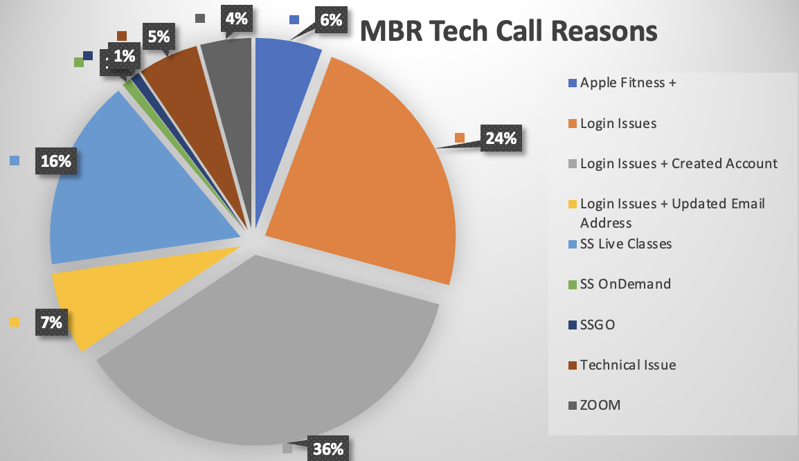
As the user base grew, so did the amount CSR phone calls that came in, voicing concerns over their inability to access live classes via ZOOM.

Early Data & Interviews
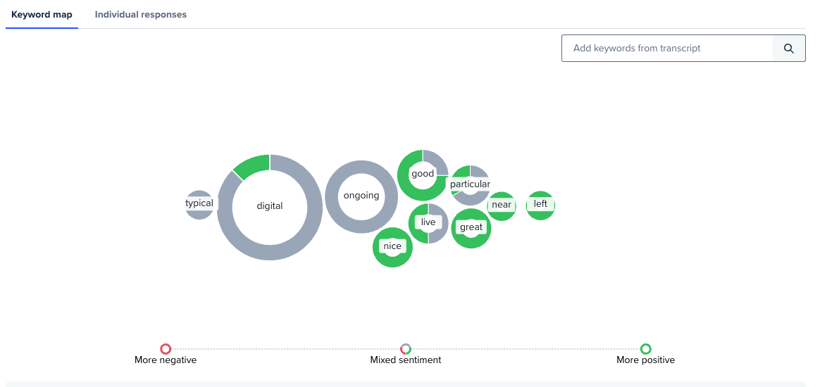
Early on we utilized Google Analytics to determine what people were using the search/filter functions for on the class schedule page. Our findings were somewhat surprising, as users appeared to be more inclined to select their classes based on instructor, rather than class type.
This finding was also backed during our user interviews, where I found that most of the members who utilize SilverSneakers classes were largely unaware of the different names & types. The members just knew that on 8AM Saturday morning their favorite instructor Cheryl would be teaching a class in the day room at the local community center.
Obviously “Cheryl” and the ideation of an 8am Saturday morning class are anecdotal. However, one cannot dismiss the findings wherein users found a far greater affinity for instructors, rather than class types.
I pocketed this knowledge and then ideated over how I would integrate these findings into the newly minted digital fitness class experience.

Reclamation & Vision
I set out to work with the product manager to tackle the issue at hand of increasing member access to digital classes, while reducing the amount of customer service rep phone calls.
Our plan was 3 pronged in action and utilized an iterative approach to rolling it out. It included the following steps:
1) Create an access point for all users who access our online platform.
2) Front-load the experience into a seamless UI, conducive to the SilverSneakers brand.
3) Create a feedback collection system that used smart learning in conjunction with a content management system.


Information Architecture
The first step in the redesign process was establishing a refined class attendance user path. For this I previewed user interactions with the site via Google analytics and identified what most users were clicking during their visit to the website.
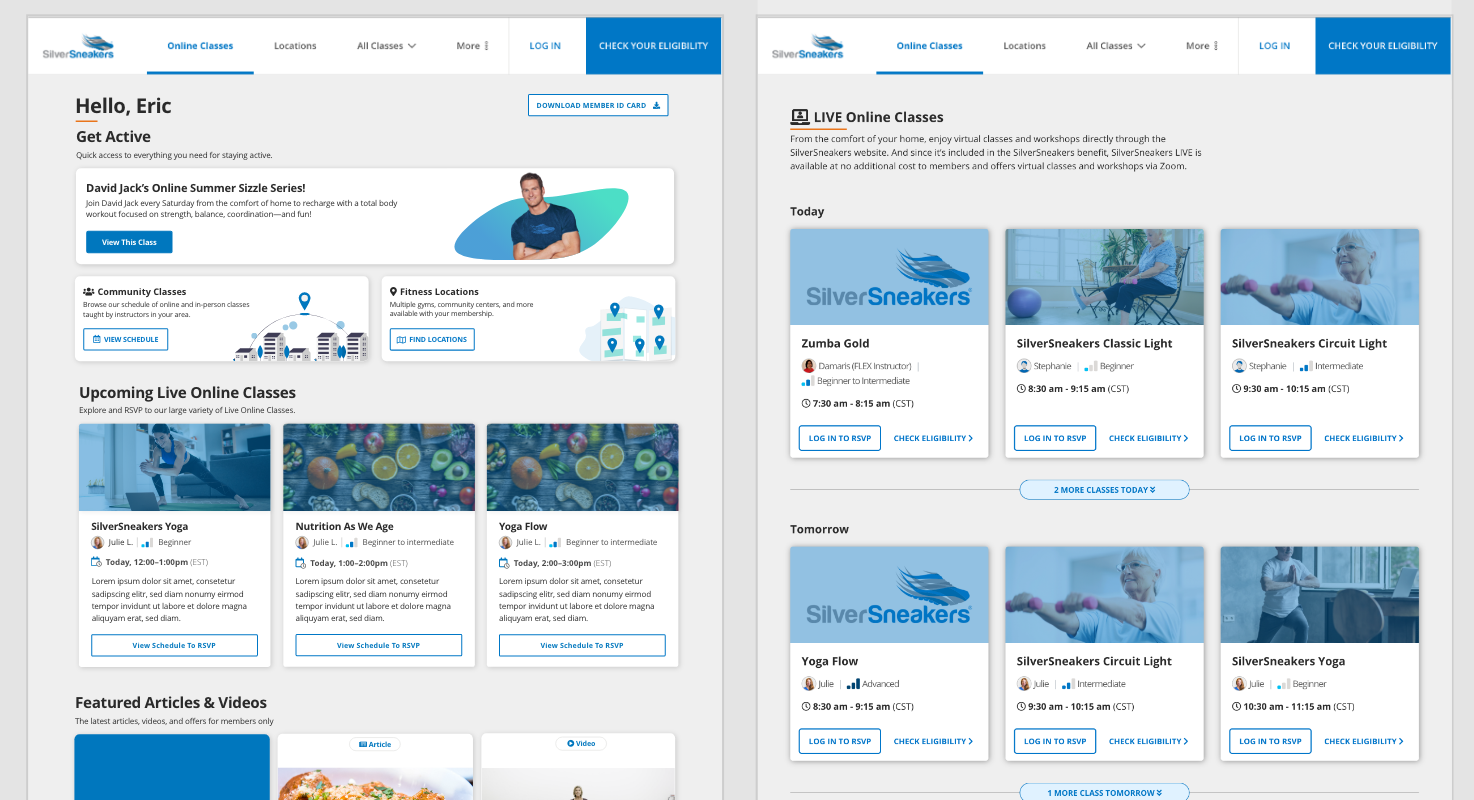
It appeared that the most frequently accessed option was the first card shown on the dashboard, which featured (at the time) an instructor and an on-demand video program.
Once I established the user flow I began playing with different conceptual wireframe designs. I knew that I needed to present live virtual classes in a way that attracted the user’s attention, while not coming across as overly intrusive.
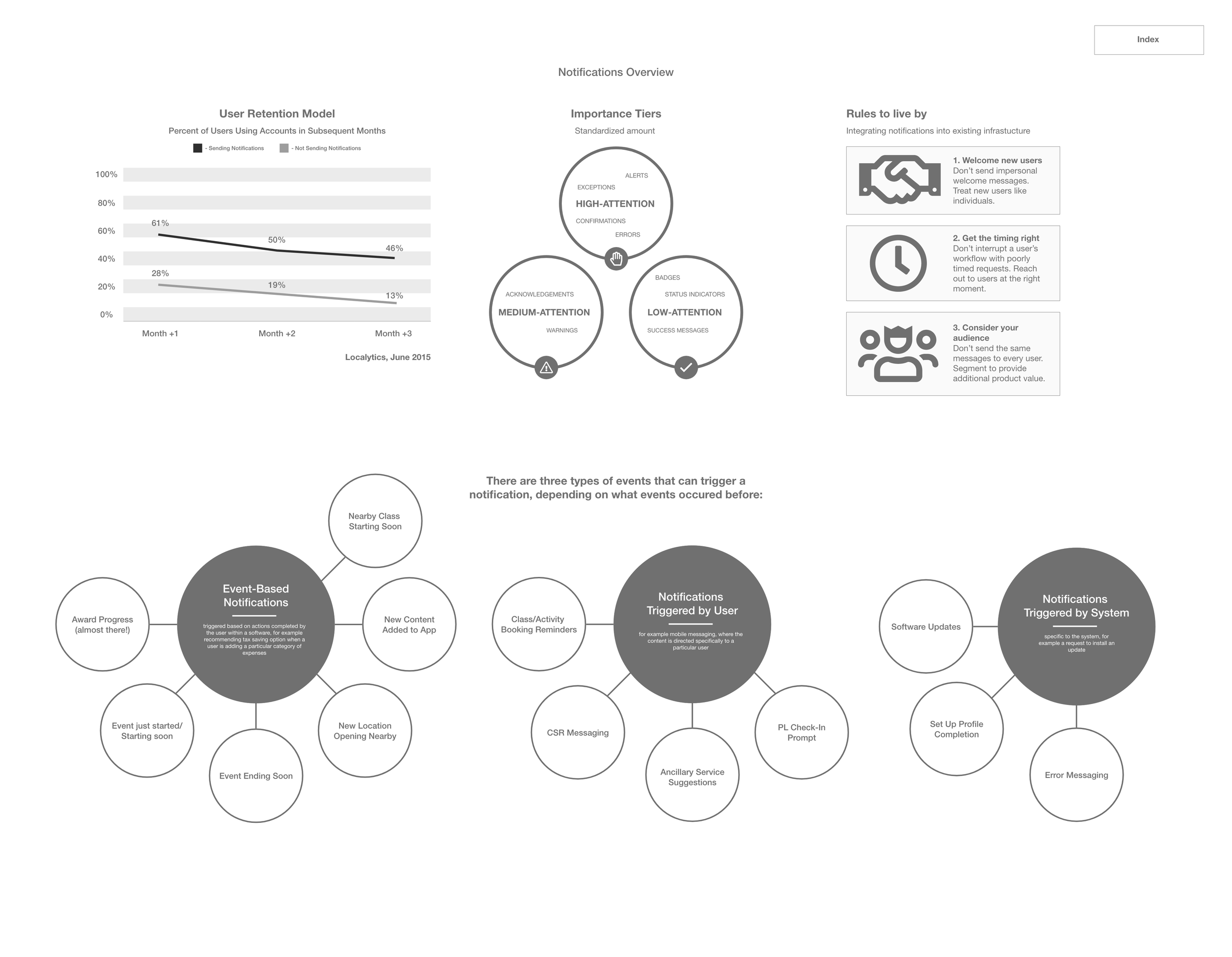
The biggest tool that we had at our disposal was the visualization of what classes were ongoing, versus those that were upcoming. This way, we can present the most up-to-date content at the forefront for our users.
Data models and flow charts like those attached helped establish what the UX was going to encompass early on and earn buy in from stakeholders.

Wireframes & User Testing
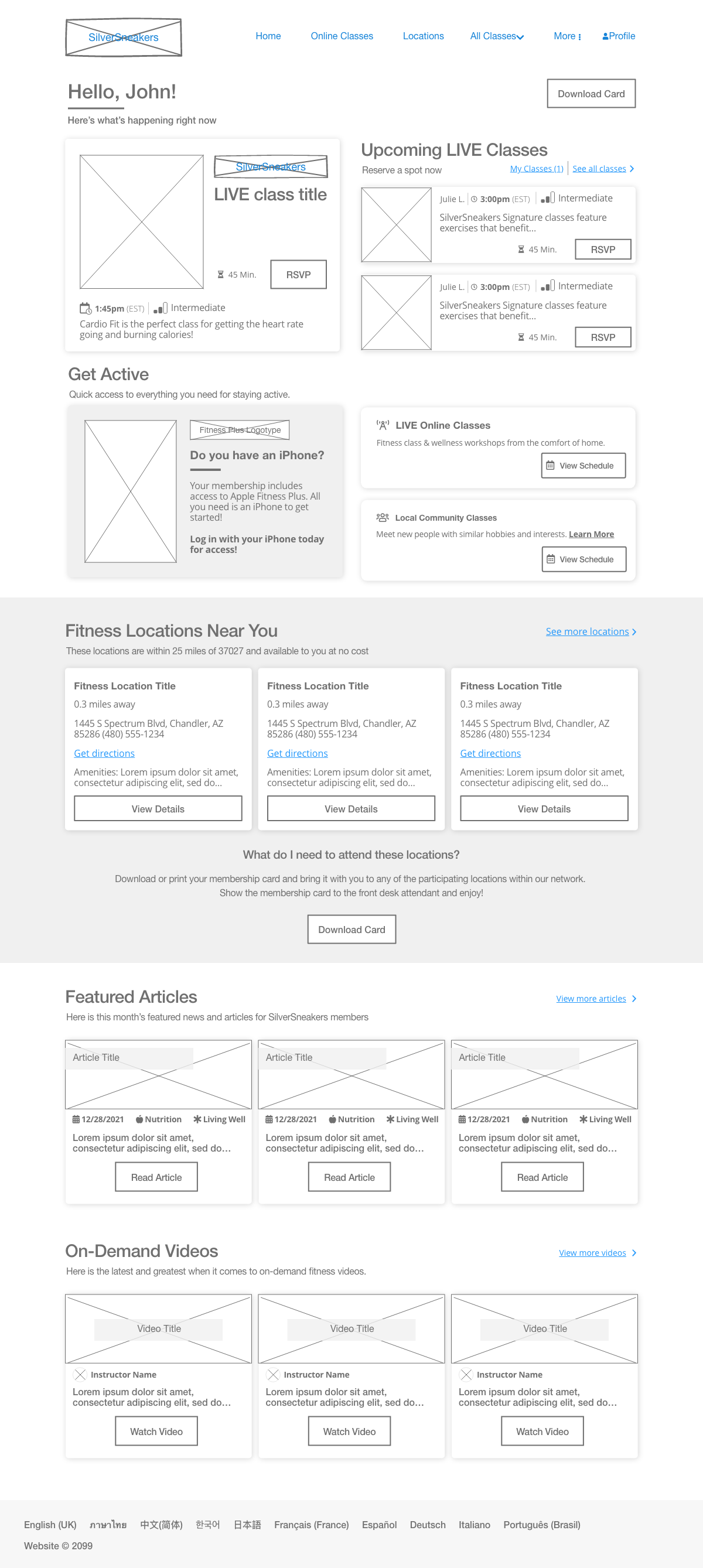
Once the primary user flows were established, it was time to create some wireframes to represent these experiences in a testing environment. I focused on the inlet experience form the member dashboard as the point of emphasis, as every user would gain exposure to the product from there. My wireframes included the following use cases:
The RSVP process for upcoming classes
Entering a virtual class
Communicating with others online
User testing proved fruitful, as users produced knowledgable insights into accessibility pitfalls like small text on the legacy experience, versus the updated version. They also liked the consolidated organization of elements in this layout, clearly identifying the focal point as the LIVE class panels.

The Anatomy of a Class Card
The primary emphasis for improving the UI lied within the exposure of the product and the instructor. However, we had learned early on due to filter usage and user interviews that online SilverSneakers members are drawn in more by instructors than the class types or details.
Therefore, I set out to design a product that brought the dedicated user base their favorite instructor in action…unfortunately we did not/still do not have high resolution images or stills of our instructors in action to this point. So I used the imagery that I had at my disposal, which where promo shots.
Fortunately, the minimalist aesthetic of the card paid dividends, as users flocked to the daily classes presented by their favorite instructors.
Said elements of simplicity include a logotype devoid of the shoe, the title of the class and a portrait w/ accompanied graphic. The class details are housed within the gradient overlay, in order to ensure a stark enough contrast between the foreground text and the background elements.


UI Mockups & Component Library
The mockups were designed with the SilverSneakers aesthetic in mind, while adding an element of digital access to the existing UI.
I focused the design around the approach of a snapshot view of the upcoming classes near them. It is then followed up with our the member’s nearby gyms, and finally partnered content they can access at any time.
Each partnership page features an informative “about” page, explaining the offering in further detail. This answers the user’s need for an overview of each product.
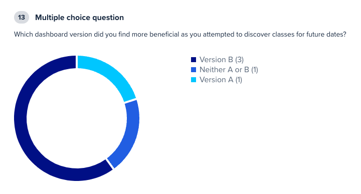
It took some usability testing and a small sample-sized A/B conversion test over the legacy version to prove the value in the design, as we see a major spike in class attendance conversions, as well as user comprehension and accessibility, respectively.
In addition to the initial concept design, I worked with a junior designer to establish a reusable library based on the winning concept. We have continued updating the library as the product evolves. The upcoming UI will feature a different base library, rather than the legacy bootstrap library with which this was built on.
User Feedback & Adjustments
Our testing pool consisted of older adults with limited exposure to digital online fitness streaming products. A pre-screener was constructed, targeting users ages 60+. Unmoderated testing was conducted via UserTesting.com.
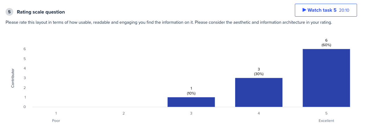
We decided that high fidelity mockups would be the best avenue for collecting valuable user feedback in this medium, due to the emphasis on aesthetics within the layout of content.
Our initial findings were overwhelmingly positive, as users were fully capable of understanding what classes were ongoing, versus those that were upcoming on the variant layout redesign.
We were able to compare and contrast the value of this new layout design by testing it up against the control legacy version with the same lineup of tasks. Mostly everyone found the variant to be superior in its layout aesthetic.
We also tested the user’s ability to navigate the class schedule, as well as the embedded Zoom class page, in order to justify the development cost of the work.


Release & Results
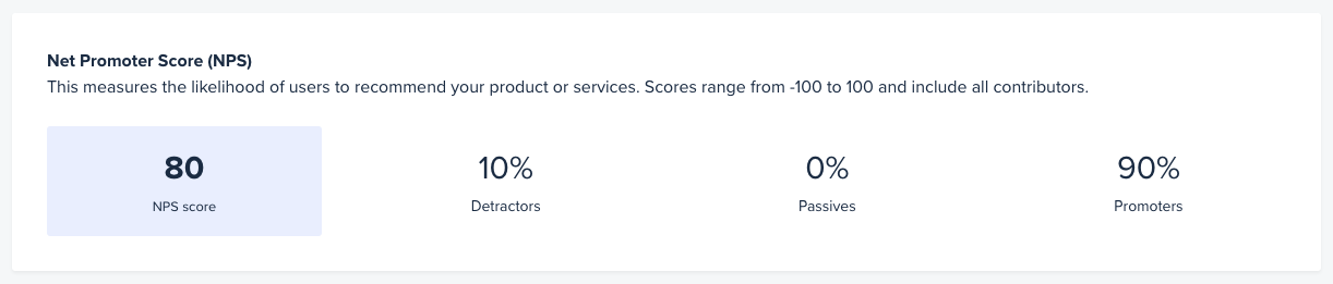
We tested these concepts very thoroughly leading up to the release and continued to yield high affinities. Attached is a screenshot of the 80% NPS score we accrued via UserTesting.com during our usability tests.
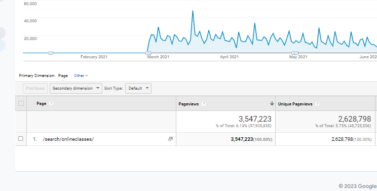
The initial release of our LIVE class schedule and user dashboard yielded an enormous boom in online visits, as we saw the time spent browsing cut down immensely as well.
The product team witnessed such a noticeable lift in LIVE class attendance that our servers ended up crashing the first day of release, due to volume of traffic. Our initial KPI for attendance was somewhere around 2.2 million for the year, however we outshot this release by accruing over 3.5 million viewers. The Google analytics graphic is indicative of the boom in retentive online traffic, which can be attributed the improvements to the user dashboard, class browsing experience, and online class viewing experience.
We have since further expanded our offerings through partnerships and have modified the digital experience to better accommodate users with quick links and extended product descriptions to better educate users on their benefits.
Apple Fitness+, Stitch Community Events and other 3rd party offerings continue to integrate within the digital class experience, diversifying the user audience to an outward funnel of digital offerings. These offerings keep the product fresh, while immersing the user in the interests they gravitate towards.
It is a positive feeling that my efforts have assisted millions of older adults maintaining their health & wellness during one of the most trying periods in our country’s recent history.