
SilverSneakers GO
SilverSneakers GO is an app designed to accommodate older adults in the pursuit of their fitness goals. I was tasked with raising user engagement while encouraging healthy activities and habits.

Background
In 2021 product innovation team was tasked with coming up with a feasible solution that would encourage SilverSneakers members to participate in physical activities.
Our canvas was the SilverSneakers GO mobile application. The application had previously existed as a gym-companion app, with little incentive for retentive use. Our goal was 2-fold in this regard; create a retentive model of fitness encouragement by improving upon an existing product.
We set out to understand the task further by working directly with the VP of innovation. He gave my team guidance on the product scope, emphasis, POIs, and limitations.


User Research
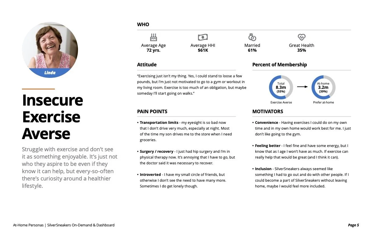
Our users are classified as older adults (65+) with varied personas pertaining to their fitness and activity. This largely relates to users who workout from home, workout at a gym, and a hybrid of the two. We worked with the data and analytics team to conduct interviews, distribute surveys, and put together personas based on our data:
Self-conscious exercise enthusiasts (digital affinity)
Independent solo maintainers (gym affinity)
Introverted help seekers (gym/digital affinity)
Insecure exercise averse (none of the above)
Synthesizing existing user data was a great way to understand who we were designing the product for. The goals and pain points serve as limitations, which are indicative of the barriers our user base encounter.
Once we had established prospective user data, it was onward to defining a user flow.

Framing and Opportunities
We explored multiple concepts around an app and how it could continue being utilized as a gym-based companion for legacy members, while surfacing billable activities for the health plans.
In a nutshell, both the user, as well as the business benefit from participation in particular activities more than others. These includes various health and fitness-based activities like the following:
Going to the gym
Attending an online workout class
Reporting positive health & fitness benefits as a net result of SilverSneakers
Keeping these considerations in mind, I set out to gain an advanced understanding of the prospective user base.


User Flows & Pain Points
Understanding the principle interaction model was a crucial step in the procurement and retention of members. The primary issue we encounter or “pain point” is the reliance on 3rd party gyms to input member visit data within an expedient manner. This leaves the user wondering about the reporting of their progress, as the member visit data takes up to 90 days to populate from gyms.
My fix for this conundrum was the implementation of a “self-check in” service, that was reliant on member gps data when they were close to the participating facility.
The flow of interaction is triggered by either a push notification, or by scanning a QR code via desk placard. Users found the interaction very intuitive and seamless to understand when presented via testing.
This issue remedies the inability for members to check into gyms and get their results instantly. However, we still had to solve for the case of users without a reason to track their progress…

Gamified Interaction Models
We conducted a series of user surveys with members of our demographic and found that users were more likely to immerse themselves within a fitness-tracking experience if they were able to “gamify” their goals.
What this equates into is an opportunity for us to synchronize health, fitness, and wellness goals into actions that correlate to success, either intrinsic or extrinsic in nature. With this in mind, we conducted a series of data flows and information architecture models to reflect the various intricacies associated with how our users would interact with the GO product over time.
Through our discovery research we found that “ranking up” via healthy habits was a fun and inviting way to track their healthy eating and fitness outputs over time.


Initial Concepts
Understanding the information architecture gave me the ability to understand the data flow and endpoints associated with what we could pull into the UX, versus what we would need to collect from the member in order to cultivate a refined experience.
This portion of the design was primarily geared towards putting ideas to paper, while collecting notes on how to effectively improve the experience via legacy and newly minted capabilities. This step also gave me the opportunity to establish the information hierarchy of how data would be presented to users embedded within the experience.
During this period I was working primarily in a product advisory role with an external product team. My inclination was to allow the designers to play with different concepts based on the user data and direction we had previously discussed. Therefore, simple concepts like these were produced to get the team’s ideas brewing.


Wireframes and Initial Usability Testing
Wireframe prototypes were designed to test the overall usability of the product offering. Users were given the following tasks to test their comprehension and understanding of the product:
If you were a new member, how would you access the product offerings?
Say you would like to set a fitness milestone for yourself to achieve, how would you go about doing this via the app?
In your own words, please summarize how the “Silver Rewards” program works.
How easy or difficult did you find the app to use? What were some things that stuck out?
If you had a magic wand, how would you improve the experience?
I screened and recruited users via UserTesting.com in an unmoderated testing environment to test the efficacy and usability of the user flow.


Mockups and Development
Once we had solidified the information architecture and wireframes within the experience we were on to UI design and mockups. I worked with the app product team to establish the experience, while staying consistent with brand guidelines. This included:
Work within an app-centric digital library and typography guide
Link specific user flows to compliment user stories
Use Zeplin to produce downloadable assets and specifications for the engineering team
Work with the dev/QA team to ensure interactions were consistent with designs
We cross-utilized some of the assets from the existing digital ecosphere (via SilverSneakers.com) and then stylized them to match our minimalist appeal within an iOS + android device experience. It was a tedious, yet necessary process, to create an immersive app-based experience for users.

UI Design & Aesthetic
The app’s primary influences come from like-minded fitness and training apps from across a spectrum of audiences. We collected data on user affinities via user interviews conducted on Optimal Workshop and plotted our user feedback according to their fitness app usage and what they liked and disliked aesthetically. The following apps were high on the affinity score chart for our user demographic:
Nike Training Club
Fitbit
Apple Fitness
MyFitnessPal
The primary theme among these apps is their approach to minimalism and utility over flash, which benefits a direct approach to fitness. The app’s theme draws on imagery as well as illustrations; reserving the latter of the 2 for progress and rewards, as it speaks more closely to the benefit of emotional design and feedback in these design patterns.
We also focused our user testing efforts against light and dark themed backgrounds. Our end takeaway was to design around having a light-themed aesthetic for users in a gym or outdoor setting.


Production, Analysis and Lessons
We were able to implement a newly minted UX and UI mockups into production, using the GO digital asset library and released the first iteration within 3 months of finalized designs and user stories. Our primary KPI of user engagement was measured in a month-over month format to analyze growth and losses in an A/B format. The end result was roughly a 7% rate of increase in member interaction with billable activity.
As for lessons learned through this endeavor, I think my biggest takeaway is the importance of feedback, or at least perceived feedback, for the user. Users abandoned GO in previous iterations because their workout efforts took months to materialize on-screen. This demoralized and deterred users. I truly believe that the app could e a primary driver of user engagement if the business is willing to invest in the user experience and how it benefits the user.
Our launch serves as a study proves that there is sufficient value appended onto the offering when users can see their progress in real time, in an effort to meet their goals.